About
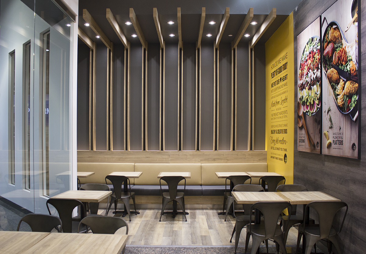
As the Pumpernickel’s brand expands into 13 stores and more in one year, the brand identity has taken a slight shift. With more environmental design elements appearing in the stores to reinforce the brand, the logo and identity has taken a more monochromatic approach.
Identity: The logo has been integrated with wordmark in some applications for a tighter brand aesthetic.
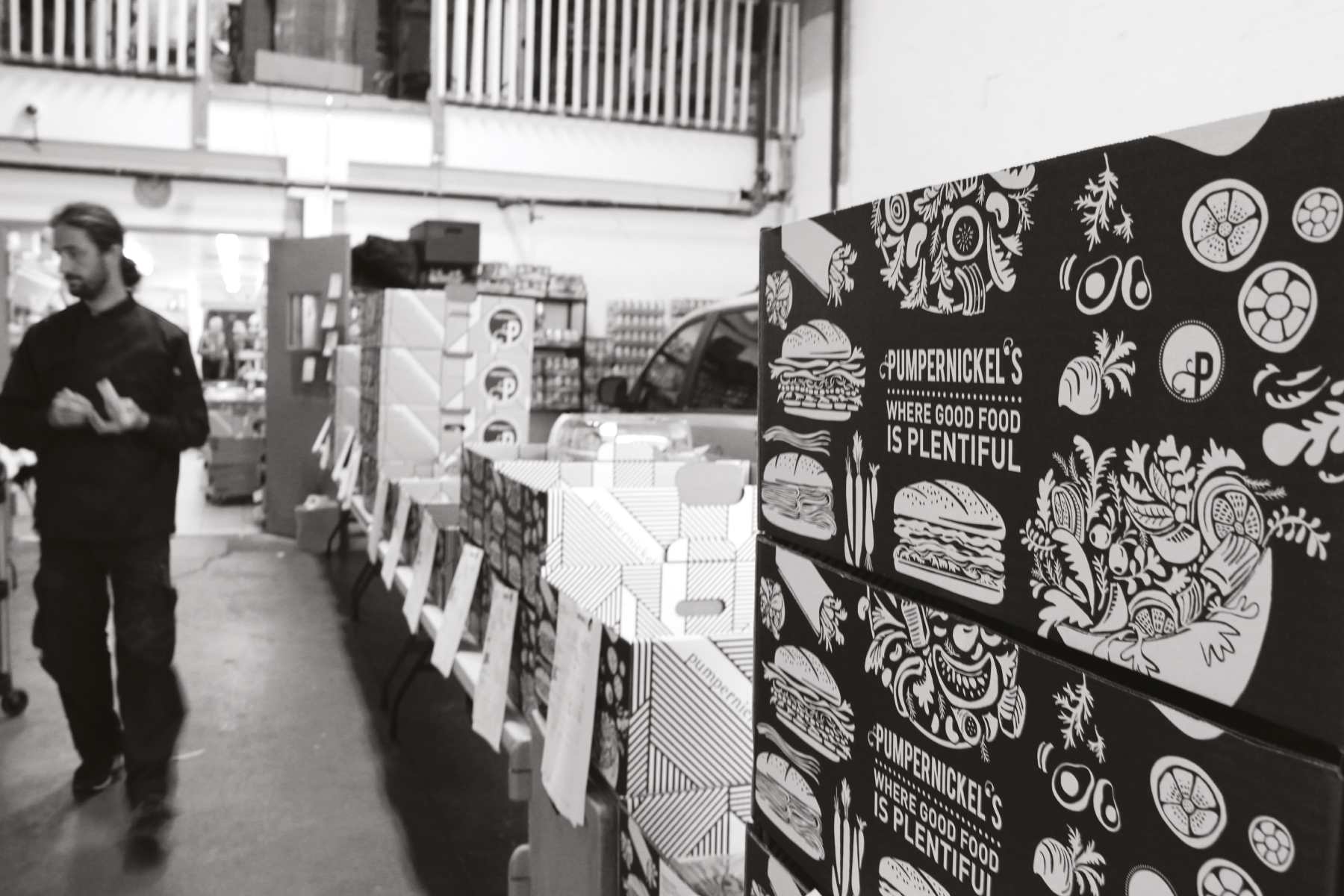
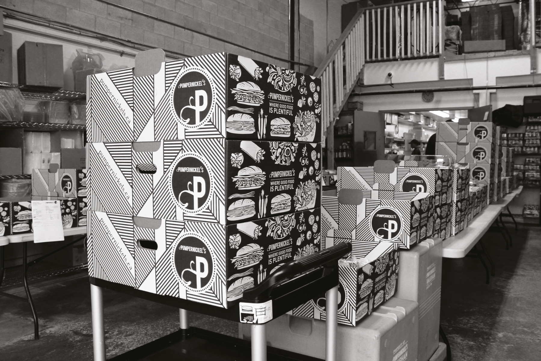
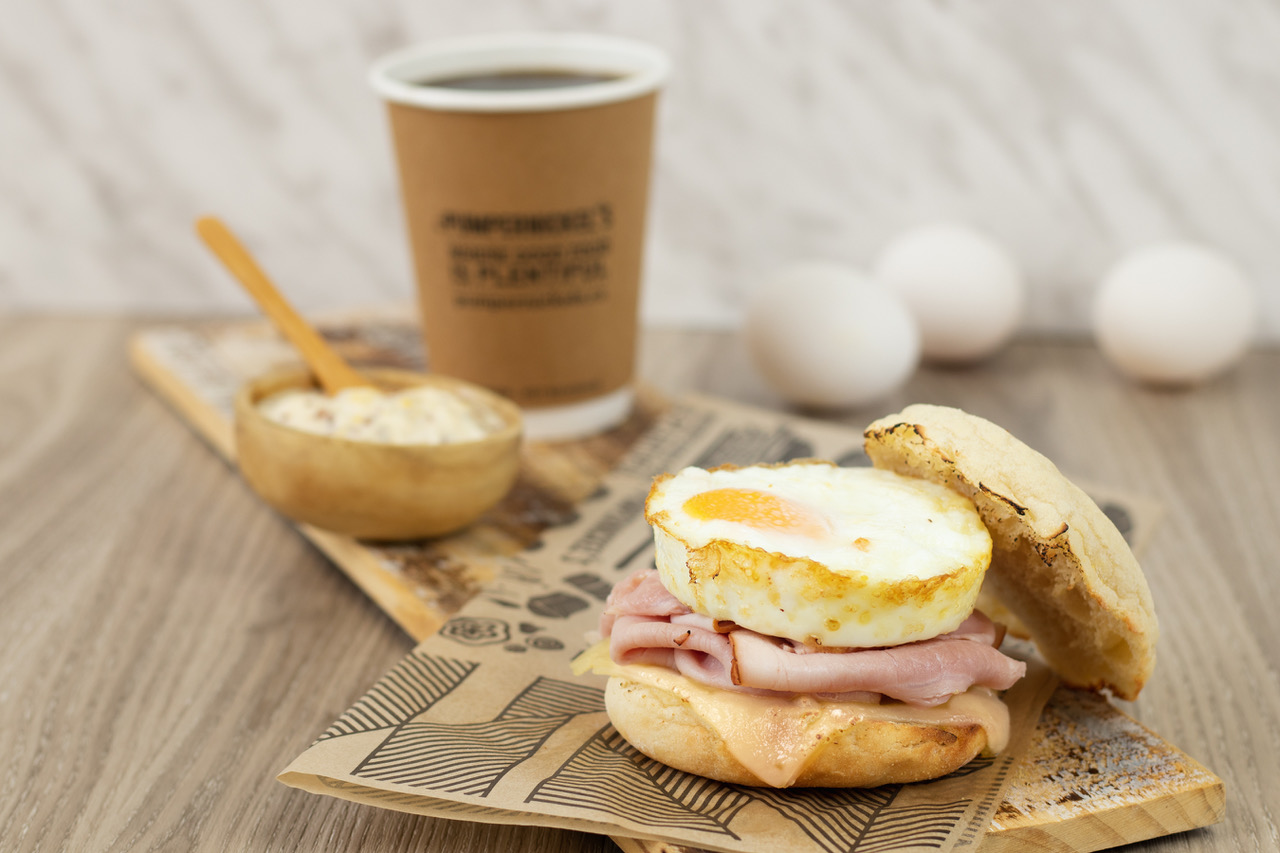
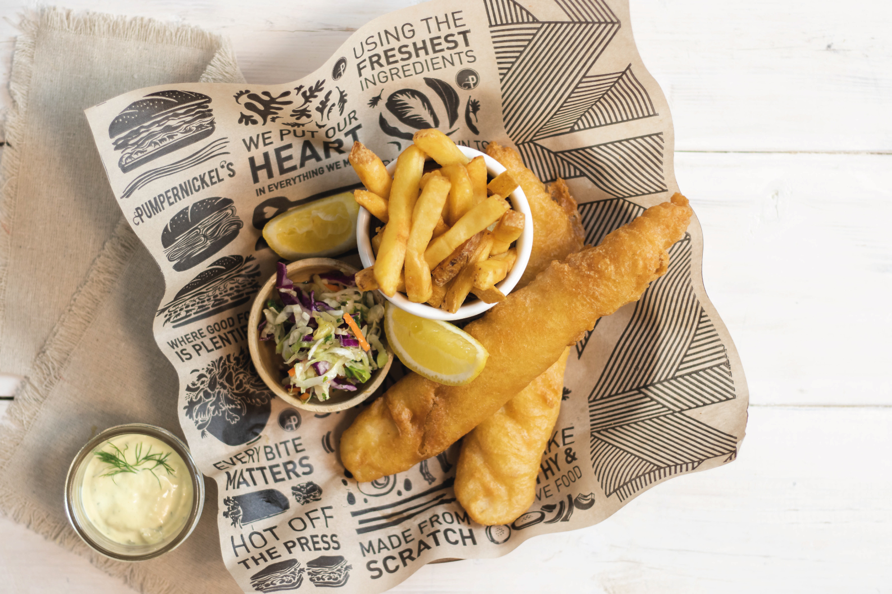
Custom illustration for packaging: We have created a whole series of original hand-drawn illustration to inject some fun into the new monochromatic scheme. This is interlaced with Pumpernickel’s Mission statement to give it a fully brand-specific application.
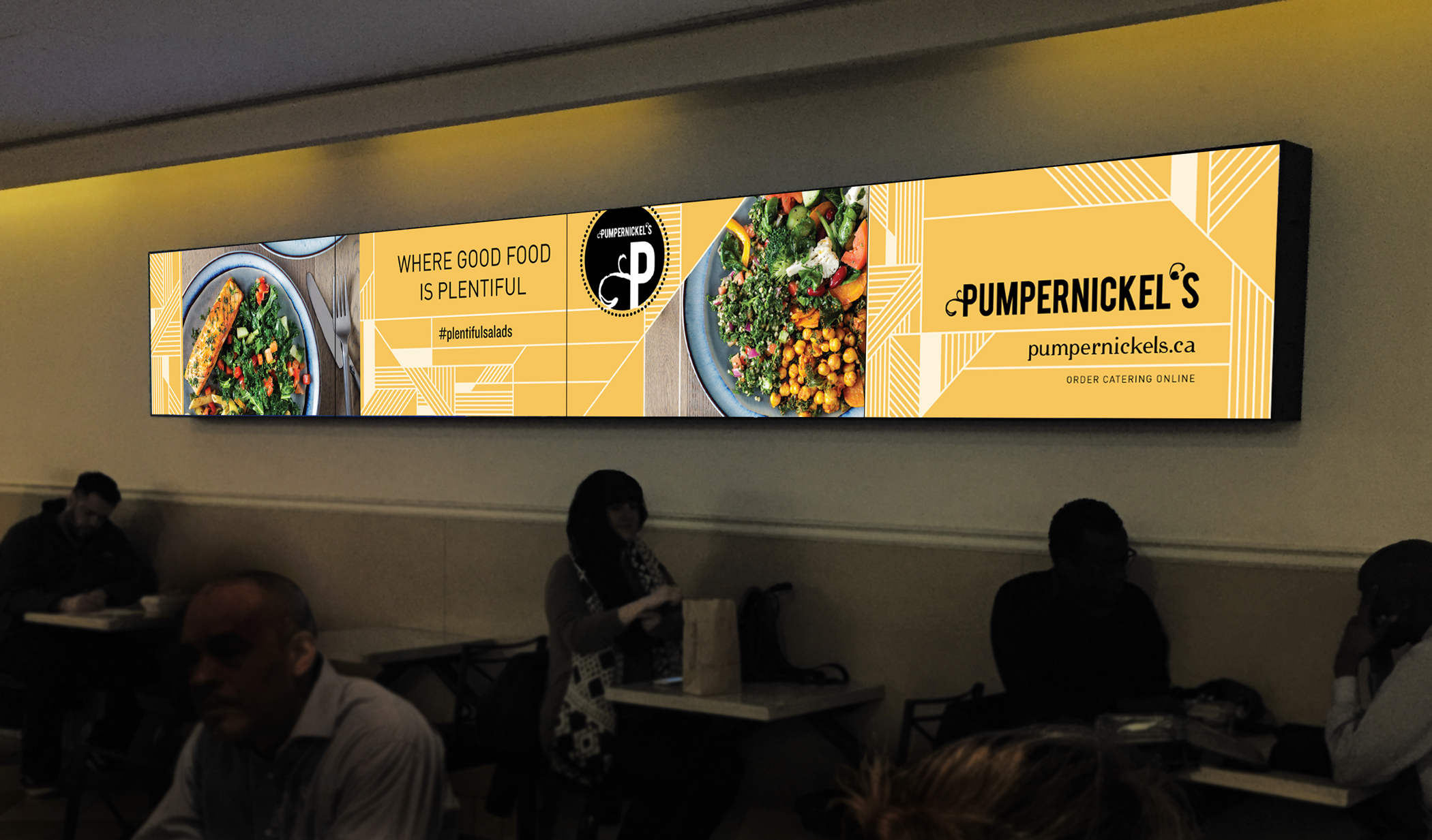
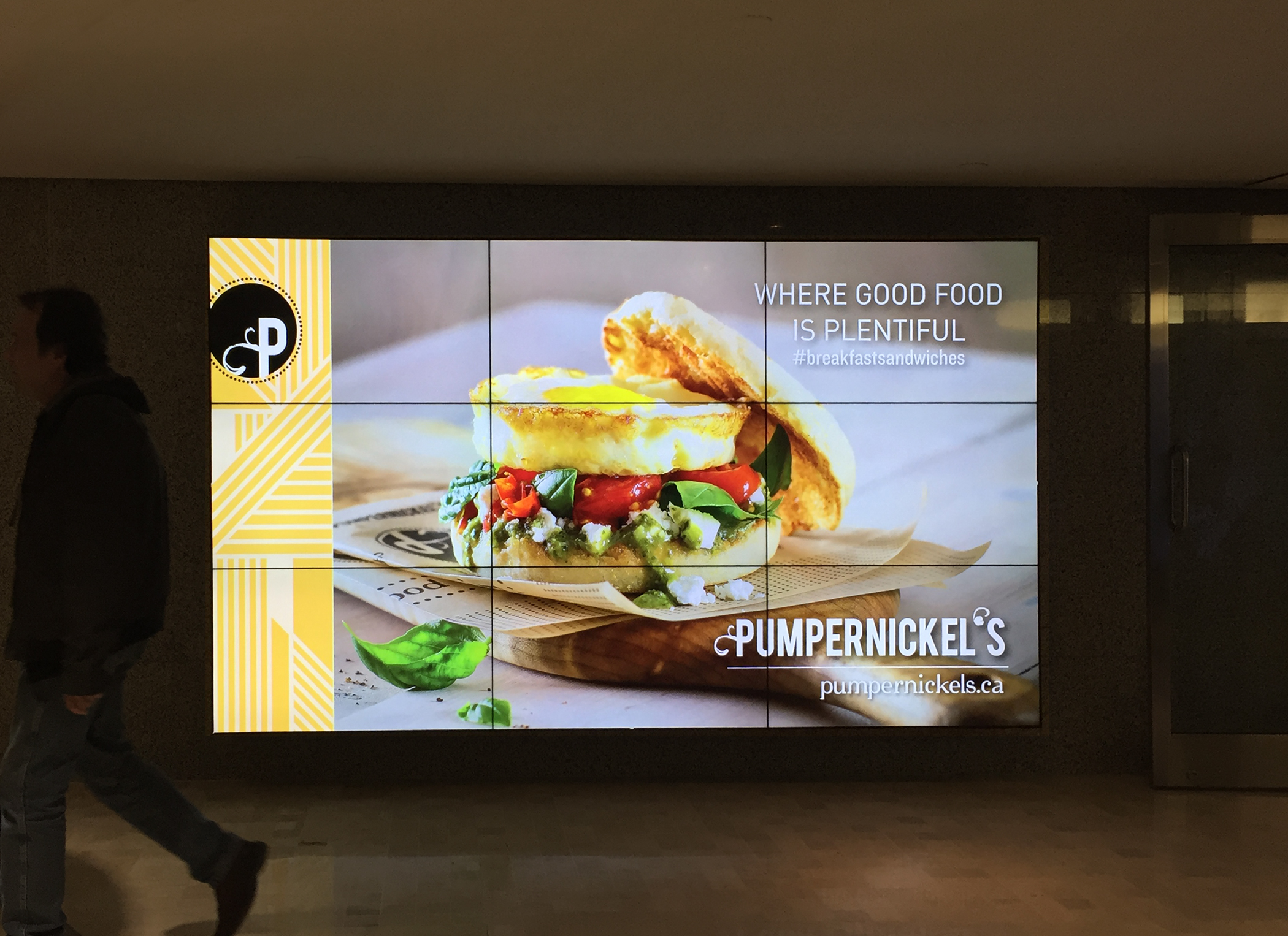
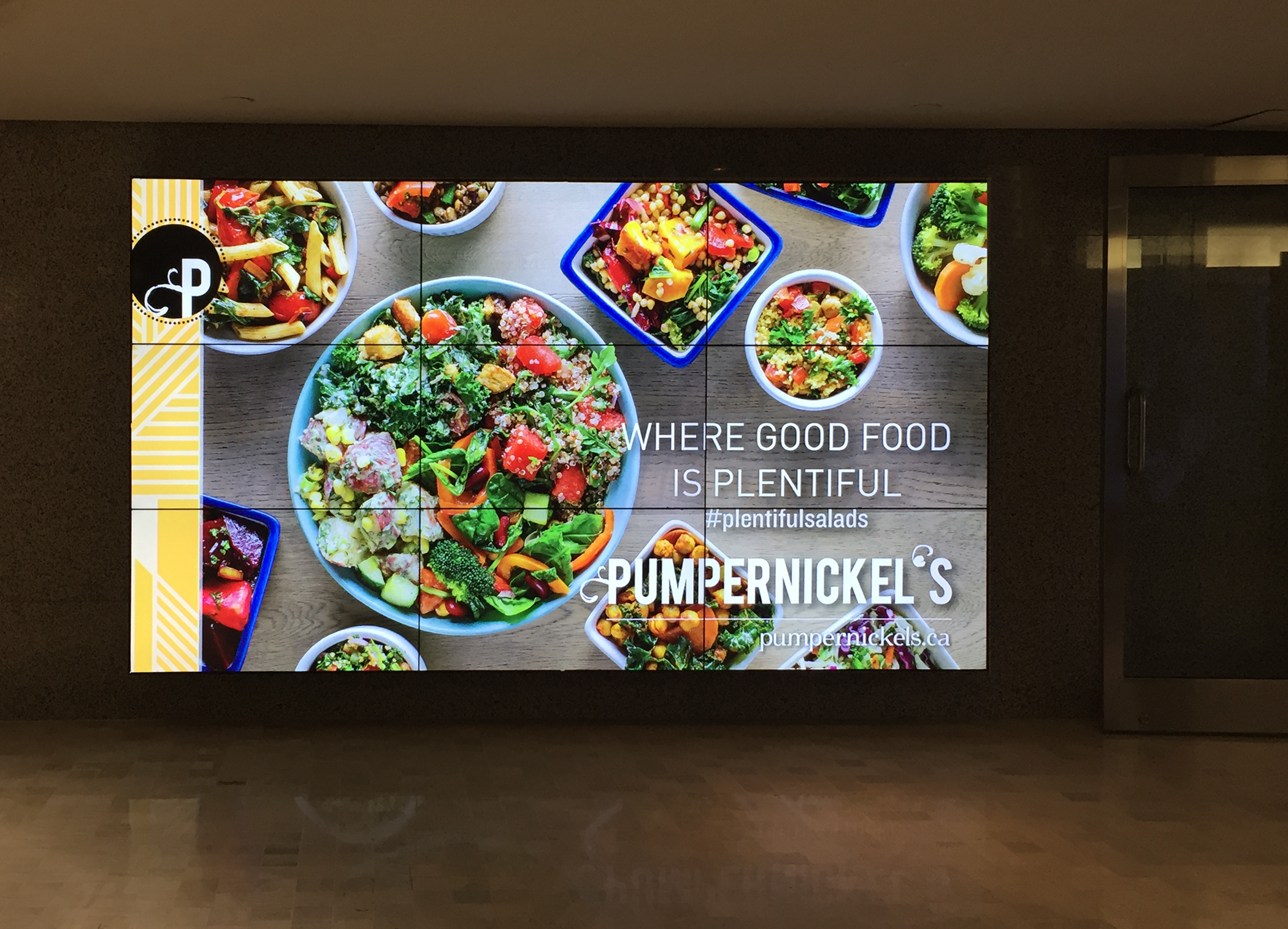
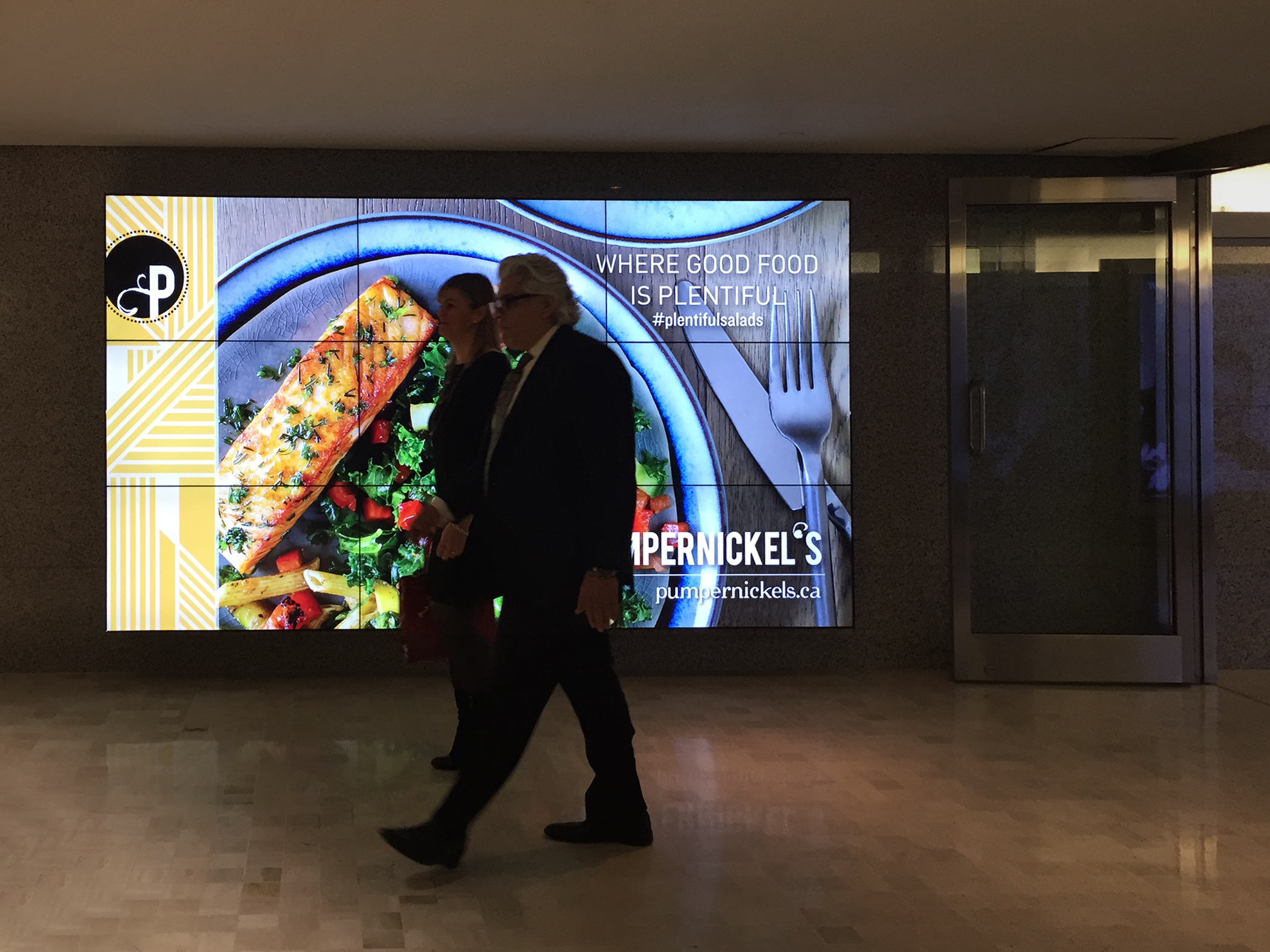
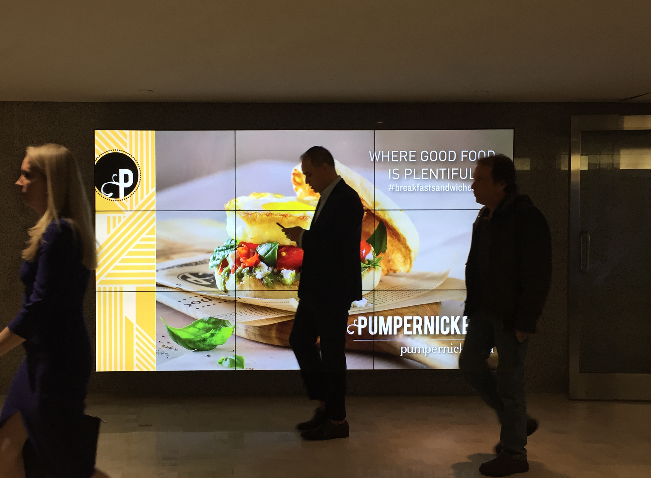
Digital Ads: Fresh digital ads and menu boards call for new photos and new direction.
Art direction for photography – in collaboration with Brandon Barre (photographer) and Noah Witenoff (food stylist)
Website: The full online catering catalogue – with image edits, featured product photography and hero banners.
Ordering Catering online is now accessible on desktop and mobile devices – in collaboration with Convergine (web developers)
Brand identity – Logo, identity, font & brand specs
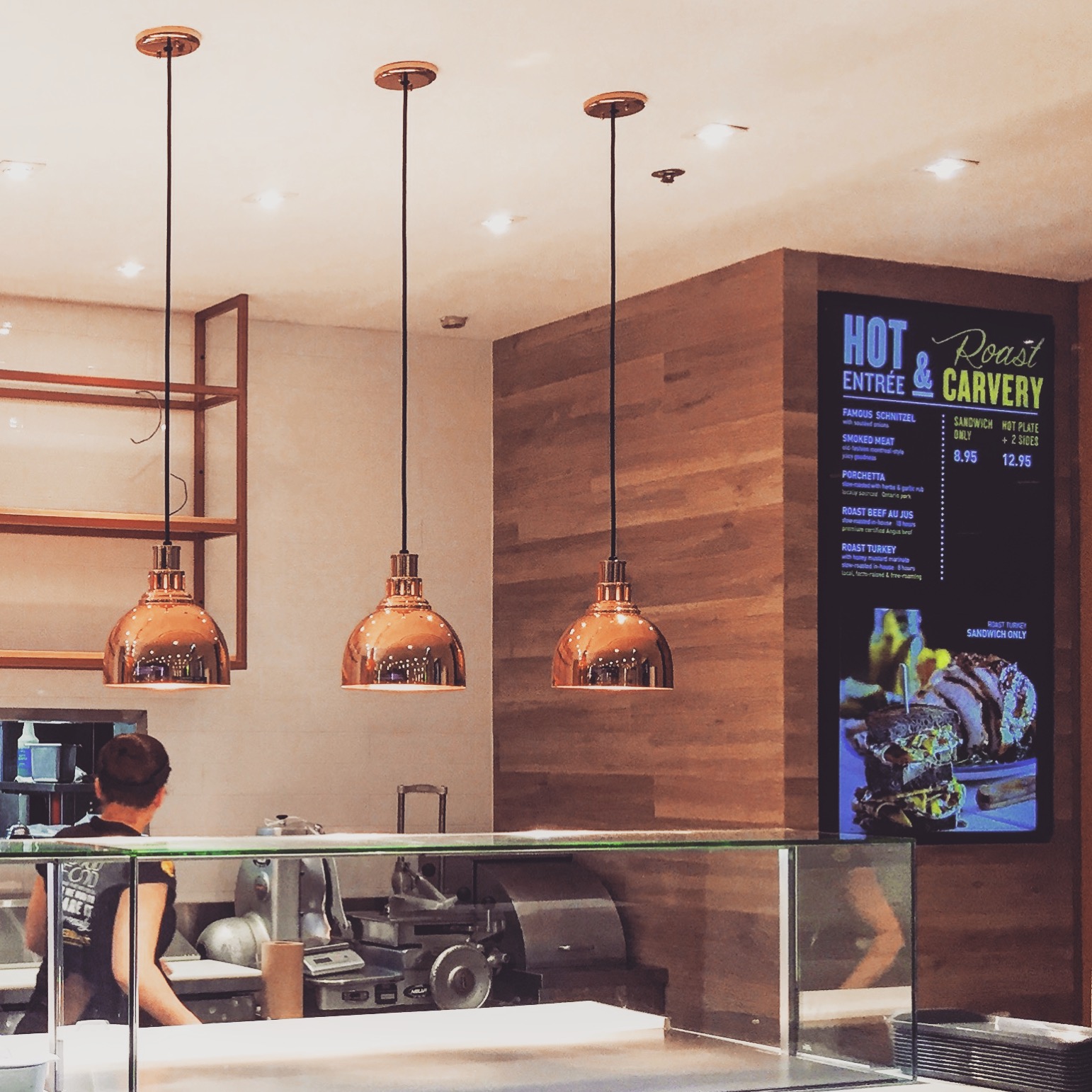
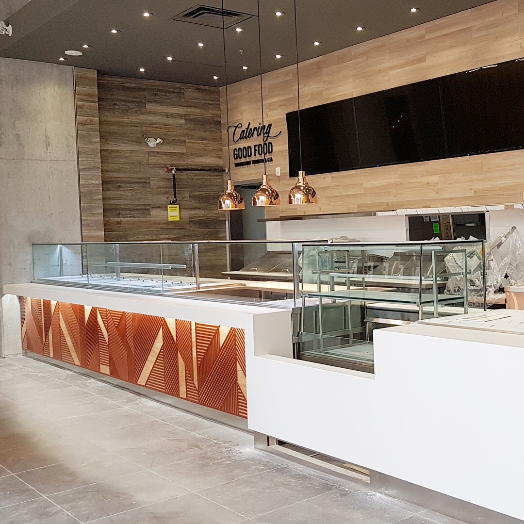
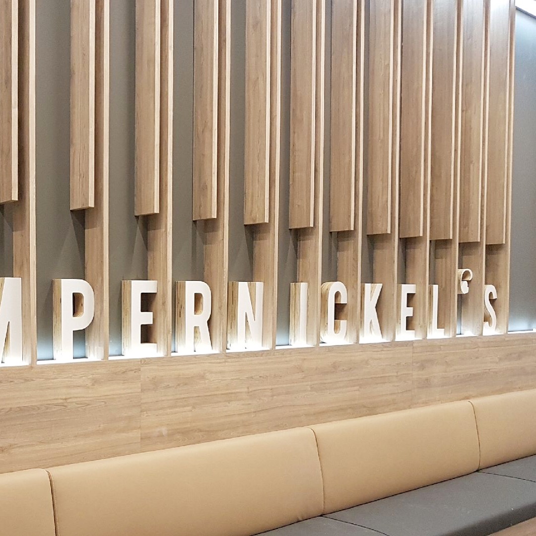
Store design – environmental graphics, interior elements, construction details
Website – art direction (view)
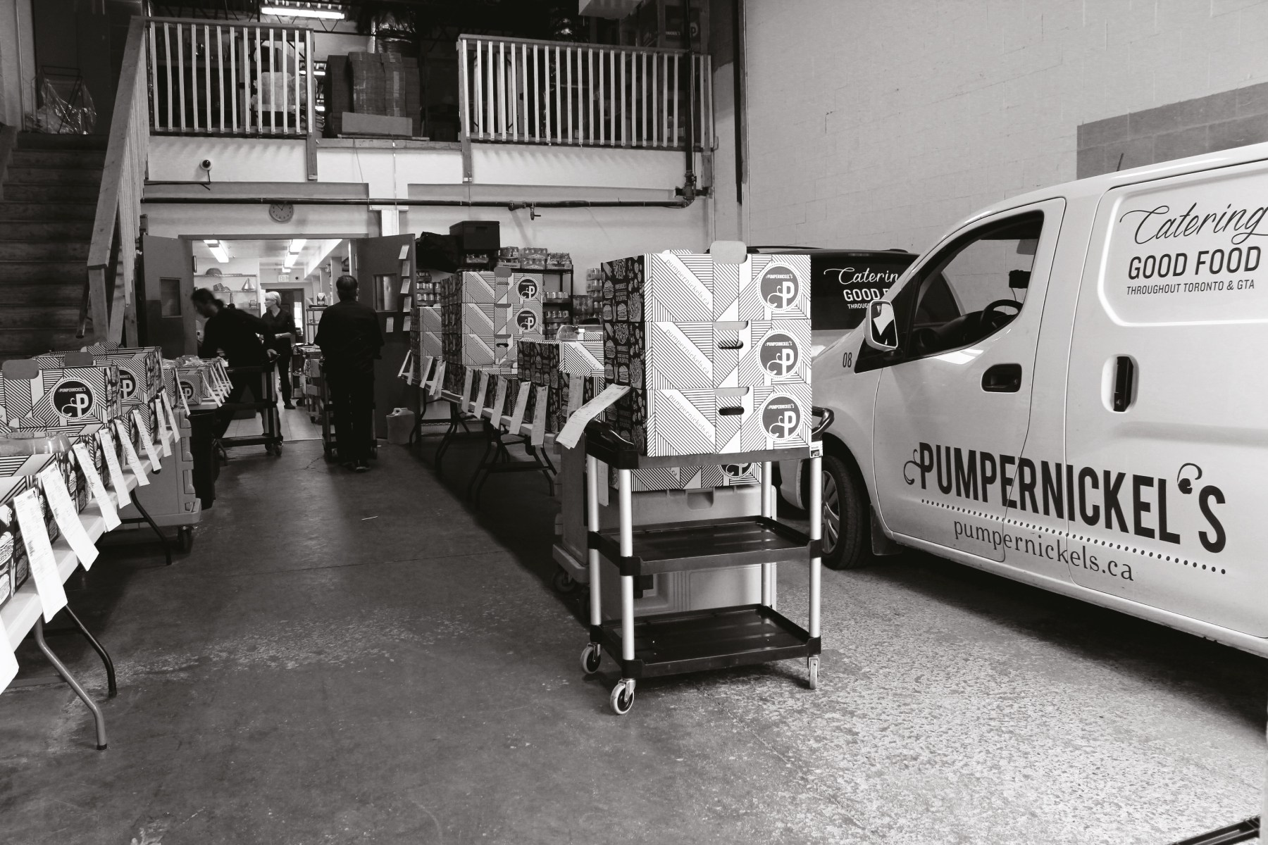
Vehicle & Staff branding
Packaging – cups, napkins, wrapping paper, bags, containers
Marketing applications – digital, stop-motion video and multi-media ads
Art direction & Food Photography